


Framed or unframed, desk size to sofa size, printed by us in Arizona and Alabama since 2007. Explore now.
Shorpy is funded by you. Patreon contributors get an ad-free experience.
Learn more.


- The Last Bickford's
- Re: And literally just around the corner
- Straight from Central Casting
- And literally just around the corner
- How did Vachon do it?
- Clean on the outside
- You write Bickfords, I write Bickford's
- Clean Outside In
- Don't interrupt the photographer
- Immortalized for Posterior
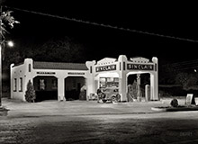
- Still standing on Fayette Street
- Takin' Care of Business
- Balt Noir
- Joke
- I Wish
- Texas Landscapes
- Unfun
- Not just one
- Dress Code
- Status
- Brakeman?
- A couple of Stormy Kromers
- ¿Por qué dos locos?
- Oklahoma
- Dos Locos
- Double Header
- Wagon Top!
- It really is that flat
- Time Travel
- Now I know

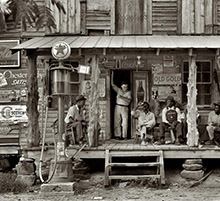
Photos submitted by Shorpy members!
Printporium


Sweet Chariot: 1956

Jan. 17, 1956. "Raymond Loewy's Jaguar car. No. 8." Happy 120th birthday to the famed industrial designer. Gottscho-Schleisner photo. View full size.
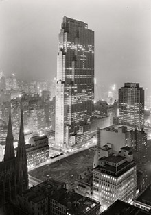
Central Park West
The view is from Central Park, just in from Central Park West, looking to the west along 67th Street. The domed building is the Christian Science Church. To its left is 75 CPW, a 48-unit apartment building that opened in 1929. Further to the left, on the south side of 67th, are the apartment buildings at 2 West 67th (69 units, built in 1918) and 65 CPW (102 units, 1926). Out of sight to the photographer's left would be the ill-fated Tavern on the Green restaurant.
Where in Manhattan
Where in Manhattan is that?
An Interesting Experiment
But I think the original XK-140 Coupe bodywork was more attractive.
Loewy and the PRR
Most of Loewy's steam loco designs were not for the NYC, but for the Pennsylvania RR. Dreyfus did the classic NYC Hudsons.
Loewy not guilty!
Loewy sold the car to boxing champ Archie Moore in 1957. At sometime after that date, all the J.C. Whitney bling was added. The horns are bad enough, but what's that clear disc on a mirror mount in the middle of the hood scoop? The grotesque grille appears to be Raymond's fault though. Here's the story.
[You have it backwards -- according to your link (as well as our photo, from January 1956), Loewy had the air horns added after he brought car back from Paris. They're gone in the 1957 photo with Archie Moore. - Dave]

Not my cup of tea
I think I preferred the car that Homer Simpson designed.
A whole new meaning
Is this where 'Pimp My Ride' got started?
Encouraging to us mere mortals
To learn that even acknowledged geniuses can have a bad day. Nothing in this design seems to cohere, yet its components presage cars like the Datsun 240Z of the early '70s (nose and headlamp treatment), the Porsche Targa of the same period (chrome "tiara"), the Griffith/TVR of the '60s (compound-curve rear window), etc. The fender-mounted horns are just plain wrong, but most of the other design elements have worked well in other contexts. Here, most people's reaction is likely to be, "Really?"
Loewy
I don't know which was cooler - the steam engines he designed for the New York Central or the Studebaker Avanti.
Kind of a toss-up for me.
Yikes!
He made it look like that on purpose? If I was a potential client, that tacky mess would definitely give me pause.
That disk on the hood
Is it some kind of bug deflector?
On Shorpy:
Today’s Top 5